

If you struggle like me with design, you might be interested in this AI design system workflow that I created. It will help you accelerate your ideation phase, see different possibilities for the UI and UX experience, and also give guidelines for yourself and your AI model. It can create components and even complete pages based off of your specific design system.
You could have a design system looking like this (best viewed on desktop) with just a few prompts and tweaking.
80% of it was created just through the prompts I’m going to share.
The AI Design Workflow Process
Table of Contents
Core Steps
In order to make this work as expected you have to follow specific steps.
Remember the following: context, context, context. AI models behave more predictably when sufficient contextual information. In other words, you only feed it what it needs.
Garbage in, Garbage Out.
My whole philosophy on this workflow that I’m about to share: if you a solid starting point AI can piggyback off of that.
The steps you need to follow:
- Use ChatGPT Deep Research or other tools to gather relevant documentation on a UI framework
- Refine that documentation
- Setup IDE AI rules to selectively grab UI documentation
- Start your app with a solid starter or template
- Use AI design system prompt
- Guide and correct the output
ChatGPT Deep Research to Gather Documentation
You’re going to gather all the documentation into one markdown file. That markdown file will eventually be fed into the AI model.
Here’s the prompt:
					Go to [URL] which is the documentation for [UI framework Name].

Note all the names of the components. [Any additional constraints]

Now make 1 markdown file with all of the components describing what each is meant for, navigate to its page to see an example of how to use it, details on the usage of that component and its API if provided, the base tailwind css classes for that component [Only if the UI framework documentation provides that], and additionally for each component, list what other components are commonly used along with it.

Group the components using headers in the same way that they’re laid out in [describe how they're laid out]
An example of that:
					Go to https://ui.nuxt.com/components which is the documentation for Nuxt UI.

Note all the names of the components. Skip any that are marked as “PRO”.

Now make 1 markdown file with all of the components describing what each is meant for, navigate to its page to see an example of how to use it, details on the usage of that component and its API if provided, the base tailwind css classes for that component, and additionally for each component, list what other components are commonly used along with it.

Group the components using headers in the same way that they’re laid out in the page such as Element, Form, Data, etc.
Deep Research Isn't Perfect. Review. Refine. Revise.
AI models are powerful, but they are not perfect. And you’ll notice this with the output from ChatGPT Deep Research.
Go into Cursor or Windsurf. This is the part that you iterate. In my case, I used Windsurf.
Your main goal is to clean up the markdown file, add anything that was missed, and add URLs to the documentation so that the agent can go to the original documentation if necessary.
Here’s the prompt for that. Use a powerful thinking model for this. Some recommendations: o3, o4 mini high, Gemini 2.5 Pro, Sonnet 3.7 Thinking and Sonnet 4 Thinking (but keep a tight leash on it)
					I used the following prompt to generate this markdown file @nuxt ui documentation.md :

```
Go to https://ui.nuxt.com/components which is the documentation for Nuxt UI.

Note all the names of the components. Skip any that are marked as “PRO”.

Now make 1 markdown file with all of the components describing what each is meant for, navigate to its page to see an example of how to use it, details on the usage of that component and its API if provided, the base tailwind css classes for that component, and additionally for each component, list what other components are commonly used along with it.

Group the components using headers in the same way that they’re laid out in the page such as Element, Form, Data, etc.
```

Requirements:
* DO NOT change any of the documentation
* visit https://ui.nuxt.com/components, match the name of the component from the markdown file, and add the URL of where the documentation resides for the component to the markdown file. The intent is that I can find more documentation about the component I care about.
Once that’s complete you want to check if all the documentation is there. You can do that by creating a checklist.
Make a checklist of the headings above and make note which ones are in @nuxt ui documentation.md
If you see that the model is constantly making the same mistakes over and over, there might be a problem that it can’t solve on its own and you need to step in. In my case, the AI model was not able to correctly identify the sections. And this is because the HTML in the page was not consistent.
I could have taken a full page screenshot, but for whatever reason I didn’t. I chose instead to open the DevTools in my browser and execute some custom JavaScript. It extracted the sections and the names of the components in a well-defined structure.
Here’s the prompt I used to correctly identify which components were missed:
					Update the checklist from above strictly based on the following JSON. That represents the source of the truth.

```
[
    {
        "sectionName": "Element",
        ...so on and so forth
```
Once that one was done, I ran another chat window that would create a minimal table of contents of the UI framework documentation. The AI model first looks to this file as the primary source for a relevant component, before expanding its search to the main documentation markdown file.
Essentially, I want to reduce the amount of irrelevant context that I’m putting into the AI model.
Like I said, context, context, context.
					read @nuxt-ui-documentation.md and extract the following information following the same format:

```
# Nuxt UI Components
___
## Layout

### ComponentName

Description: The description

...
___

## Form

### ComponentName

Description: The description

```

Use sequential thinking.
Use sequential thinking is a special command to trigger the sequential thinking MCP from Anthropic. This MCP server is extremely useful in providing guardrails to an AI model so that it focuses on the requirements that you give to it. It does this by doing task decomposition and it doesn’t require a separate API key. It will keep breaking down the requirements until they are met. That’s what I love about it.
More info on the sequential thinking MCP server here.
When to Use Sequential Thinking
I recommend using the sequential thinking MCP server when there’s a lot of requirements in your request. This is even better than just using a thinking model alone. Use both of them together.
I think of it like this. The thinking model will look at all the possibilities and the sequential thinking MCP server will provide the guardrails so that the model focuses on the requirements in the original request.
So use it frequently because AI models tend to not focus on the requirements perfectly.
Your IDE AI Rules Determine Your Success
If you are frustrated that AI models do not respond in the way that you expect and you don’t have any AI rules set, there’s an 80% chance that’s your main problem.
Rules train mules
ChatGPT 4o
Your mule, your workhorse are the AI models. Guide them.
Here’s a couple of rules that I use:
Do not make any changes, until you have 95% confidence that you know what to build ask me follow up questions until you have that confidence
This is from Your Average Tech Bros YouTube channel and I really appreciate that he shared that. Here’s the video.
He explains how this one prompt helps solve a lot of problems where the AI model tends to go off rails because it makes assumptions.
I use this rule whenever I think there is a possibility that the model will make a lot of assumptions. EXTREMELY USEFUL.
					Mode: Model Decision
Description: Use when making UI/UX decisions, prefer a Nuxt UI component over anything else


Read @docs/nuxt-ui-components-toc.md to have a broad understanding of the components available.

For components you have identified to use, read @docs/nuxt-ui-documentation.md for detailed explanations of each component as necessary.
The secret sauce in order to selectively choose the correct component from the UI framework.
The main idea here is that we look at the shorter table of contents that we generated earlier. That file has a lot less tokens compared to the UI framework markdown file which has all the documentation. We’ll look for the relevant components first, and then expand the search from there.
I purposely structured it this way because I believe that typical tools that create vector embeddings from documentation don’t give you that great of an accuracy because a lot of times you lose context from just normal vector rag search or hybrid when you can just stuff the documentation straight into the context window. But I’ll admit I could be wrong.
Use a Solid Starter Template
Throughout my entire software development career. I found out that scaffolding can help a lot. That’s because you get a very solid starting point that’s stable and for the most part isn’t buggy.
So start off your project with a starter template that has some basic functionality, that you like, and has some of your requirements.
For instance, Next.js has a ton of official examples that you can use as a starting point.
You could have a running Next.js app with Next UI by running this command: npx create-next-app –example with-next-ui with-next-ui-app and that’ll get you this.
In my case I loved this template: https://github.com/ryntab/Nuxt-Supabase-Authentication-Template

I wanted a template that used Nuxt3, Nuxt UI, Supabase and looked great.
The AI Design System Prompt
Now here is where it gets exciting. We already have a base to work off of the UI documentation in a local markdown file and a working app from a template.
You’re going to start with following prompt:
I want to create a design system and put it in a route in Nuxt that is not protected. I will give you instructions next. Please let me know that you understand.
This primes the AI model with your intention and makes sure we start on the right foot.
Now here’s the bread and butter prompt. Notice how it starts with /sequential-thinking and /ensure-accuracy. These are just the rules that I talked about above. /ensure-accuracy is that 95% confidence prompt.
WARNING: I strongly recommend that you use git and commit everything that you have right now to the repository. Because this prompt is going to be doing a lot of stuff. It’s possible that it will make a change that will break your app. This will be your backup plan if a revert doesn’t work as expected.
/sequential-thinking /ensure-accuracy
# Design System for web app
## Goal
Create a great design system based on the sections below in GREAT DESIGN SYSTEM GUIDELINES to be used for the intended use. This design system uses [UI framework name] components.
## Intended Use
This design system will be for [short description of what problem your app resolves for its users. You can even describe their emotions.]. It’s target audience [describe the if the target audience is or isn't tech savvy and any other tendencies that would be useful to know].
## Specifics
1 The design system MUST BE a [Name of Preferred Framework] web app and not a written document
2 Ensure that you follow the steps for each section in GREAT DESIGN SYSTEM GUIDELINES. This is VERY IMPORTANT.
3 VERY IMPORTANT to ensure you cover all sections in GREAT DESIGN SYSTEM GUIDELINES
4 For micro interactions include things that aren’t just a simple grow animation
5 Show examples of components that could be used in the app using spacing to communicate visual hierarchy. They must be delightful in a UI/UX sense. The components must be related to the app.
6 In the examples of components ensure that use you use visual hierarchy and contrast to draw attention to a specific CTA. DO NOT draw attention to multiple elements at the same time. Avoid confusing the user.
7 Show examples of deliberately breaking UI design guidelines in order to bring visual interest and attention. Ensure you show at least 4 examples.
8 Create 4 different themes of color palette/typography combinations that I could dynamically switch to so that I could see what I like the best.
9 Avoid serif fonts. Try fonts that aren’t commonly used but are visually appealing.
10 Create a variety of rounded sizes and no rounded corners that I could dynamically switch to to see what I like best.
# GREAT DESIGN SYSTEM GUIDELINES
1 Typography: A clear hierarchy of fonts, sizes, weights, and styles to ensure readability and visual consistency across headings, body text, and other typographic elements.
2 Color Palette: A defined set of primary, secondary, and accent colors, including shades and tints, with guidelines for usage to maintain a cohesive look and ensure accessibility (e.g., contrast ratios).
3 Layout and Spacing: Standardized spacing units, grid systems, and layout patterns to guide the arrangement of elements, ensuring alignment, balance, and responsiveness across different screen sizes.
4 Iconography: A consistent set of icons with unified style, size, and weight, designed to communicate actions or concepts clearly and align with the app’s aesthetic.
5 Imagery Guidelines: Rules for using images, illustrations, or other visual assets, including style, tone, and proportions, to maintain a unified visual language.
6 Components: A library of reusable UI elements like buttons, inputs, cards, modals, and navigation bars, with defined styles, states (e.g., hover, disabled), and variations to ensure consistency.
7 Patterns: Common design solutions for recurring needs, such as forms, tables, or search interfaces, with guidelines for their application to streamline user interactions.
8 Tone and Voice: A defined writing style for text in the UI, including labels, error messages, and tooltips, to ensure clarity and alignment with the app’s personality.
9 Accessibility Standards: Guidelines for inclusive design, such as color contrast, keyboard navigation, and screen reader compatibility, to make the app usable for all.
10 Motion and Animation: Principles for transitions, micro-interactions, and loading states to enhance usability and engagement without overwhelming the user.
11 Do’s and Don’ts: Provide visual examples of correct and incorrect usage. For example, “Do: Use primary blue for main buttons. Don’t: Mix multiple button styles on one screen.”
12 Contextual Guidance: Show how elements adapt to different contexts, like a button shrinking slightly on mobile but retaining its core style.
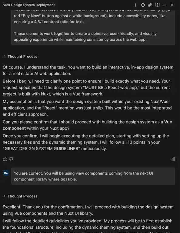
13 Contrast and Focus: Provide guidelines for using contrast to draw attention (e.g., a red “Buy Now” button against a white background). Include accessibility notes, like ensuring a 4.5:1 contrast ratio for text.
These elements work together to create a cohesive, user-friendly, and visually appealing experience while maintaining consistency across the web app.
Here’s the type of output that you should see if you followed the right steps:
Curious about the results?
If you haven’t seen the demo of the AI design system from the intro, have a look here.
From there, the rest is just refining the output.
Wrangle the AI Mule
Like I mentioned before, AI models are not perfect, but they can get you 80% of the way there. And that other 20% you can spend on refining the output.
I like a specific feature from Windsurf that makes it easy to specify which part of the web app I want to change while giving the model the context that it needs.
Windsurf came out with the new built-in browser with tools that allow you to select elements, send errors, and send screenshots to the chat window. This definitely helps with productivity.
There’s already an MCP server called BrowserMCP, but I’m starting to prefer this browser from Windsurf over that. It’s just very well integrated into the product.

I made a video showing some of the features of the Windsurf Browser.
A New Process for the Better
Wrangling AI can be challenging, but it’s a new type of process for us as developers that actually open up an immense amount of opportunities that weren’t easy before.
If you liked this article you might also like Enhancing Programmer Productivity.